Understanding Theme UI: 1 - Jsx Pragma
In this post I’m going to try and explain Theme UI’s Jsx Pragma. I hope to create a series of these posts that might help lower to the barrier to entry when learning Theme UI… let’s see how that goes ay!
I’ll assume at this point you’ve already installed Theme UI but if you haven’t, have a read of the Getting Started section from the docs
Before starting to explain the Jsx Pragma I’m going to walk you through some steps which I feel are important to understand. The explanation might be a little convoluted but bear with me and hopefully once you reach the Jsx Pragma section it’ll make more sense.
To help demonstrate some of the Theme UI’s principles we’re going to build a very simple component which you can see
below, i’ve called it <MrPragma /> and you can find the src
here
Theme Object
A core principle of Theme UI is the theme object it’s a little bit like global CSS but without all the headaches.
This is key to understanding how Theme UI works so feel free to bookmark the theme-spec page as i’ll be referring it frequently.
When your first start your site after installing Theme UI you’ll notice the background is a kind of fuchsia color. That’s fine, it means Theme UI is working and is applying its default styles.
Depending on which install method you’ve used will determine the file name and location of the theme object. I’m going to base this post on the install method for gatsby-plugin-theme-ui
To change the default background and text colour you’ll need to add a colors key to the theme object that contains key
value pairs for both text and background
// src/gatsby-plugin-theme-ui/index.js

export default {
  colors: {
    text: '#FFFFFF',
    background: '#131127',
  },
};
By default Theme UI will use text and background to style the body color and the body background-color and
before we go any further I’d like to explain why.
Theme UI’s opening gambit if you like is as follows:
Build themeable design systems based on constraint-based design principles
The bit i’d like to point out is where it says “constraint-based design principles”. Theme UI makes some decisions for us so we don’t have to, and when working with CSS some constraints are actually really really helpful. In a later post I’ll explain how to use Theme UI’s escape hatches if you don’t want or can’t in some scenarios work with the constraints
CSS Property maps
This is my opinion is one of the hardest concepts to grasp. The TLDR is Theme UI has made decisions regarding which CSS
properties map to which objects in the theme object. The HTML color and background-color are mapped to the colors
object which is why the changes above will have an effect on your overall site theme. More on this later
Object-oriented Programming (OOP):
Theme UI uses OOP to allow access to CSS properties defined in the theme object.
As a practical example go ahead and create a <MrPragma /> component and ensure you can render it to a page as we’ll
need to see the output of a console.log()
// MrPragma.js

import React from 'react';
import theme from '../gatsby-plugin-theme-ui';

console.log(theme);

export const MrPragma = () => {
  return <div>MrPragma</div>;
};
The above will log out the entire theme object. You should see all the default styles and if you’ve implemented the
above change to colors you should see that text and background are the same as the values you’ve defined.
To go one step further change the console.log() so it only logs out the values for the text key
// MrPragma.js
import React from "react"
import theme from "../gatsby-plugin-theme-ui"

- console.log(theme)
+ console.log(theme.colors.text)

export const MrPragma = () => {
  return <div>MrPragma</div>
}
And now finally use this text value to style the <div />
// MrPragma.js

import React from "react"
import theme from "../gatsby-plugin-theme-ui"

console.log(theme.colors.text)

export const MrPragma = () => {
  return (
    <div
+     style={{
+       color: theme.colors.text,
+      }}
    >
      MrPragma
    </div>
  )
}
🚨🚨 This is NOT how you use Theme UI 🚨🚨
… but it does go some way to understanding what the theme object is and how you can access key value pairs contained within it.
Jsx Pragma
In the next step I’ll explain how to achieve the same thing but by leverageing Theme UI’s super power, The Jsx Pragma.
Step One
W.T.Flip is Jsx Pragma?… well, to quote the Gatsby docs
A pragma is a compiler directive. It tells the compiler how it should handle the contents of a file.
You can take from that what you will but in short the Jsx Pragma allows Jsx to compile things in a special way. In the case of Theme UI we need the compiler to understand and compile something called The sx Prop and it looks like the below.
Theme UI’s Jsx Pragma already includes React so you’ll notice in the below i’ve removed the React import
// MrPragma.js

+ /** @jsx jsx */
+ import { jsx } from "theme-ui"
- import React from "react"
- import theme from "../gatsby-plugin-theme-ui"

- console.log(theme.colors.text)

export const MrPragma = () => {
  return (
    <div
+     sx={{}}
-     style={{
-       color: theme.colors.text,
-      }}
    >
      MrPragma
    </div>
  )
}
If you’re familiar with HTML you’ll know that sx isn’t a valid HTML attribute but by including Theme UI’s Jsx Pragma
the compiler understands what it is and will know what to do with it before the Jsx is returned to the browser.
Step Two
Use the sx prop to style a <div />
// MrPragma.js

/** @jsx jsx */
import { jsx } from "theme-ui"

export const MrPragma = () => {
  return (
    <div
     sx={{
+     color: "text"
     }}
    >
      MrPragma
    </div>
  )
}
You’ll notice here that text is a string. The word or string “text” in CSS wouldn’t normally mean anything since CSS
will be expecting an actual hex reference for a color property e.g: #FFFFFF but since the sx prop is compiled
using the Jsx Pragma Theme UI is able to look up what the string value refers to in theme object.
The reason you don’t need to write theme.colors.text is because Theme UI shorthands the OOP lookup for us by mapping
CSS properties of certain types to a constrained set of objects from the theme object
This is a small glimpse into Theme UI making decisions for us
In the case of the CSS property color Theme UI will map it to theme.colors which does indeed contain the key value
pair of text
Moreover if we introduce a new colour to the theme object called surface and give it a hex value we can then use it
with another CSS property that is also mapped to the colors object
// src/gatsby-plugin-theme-ui/index.js

export default {
  colors: {
    text: "#FFFFFF",
    background: "#131127",
+   surface: "#232140"
  },
}
// MrPragma.js

/** @jsx jsx */
import { jsx } from "theme-ui"

export const MrPragma = () => {
  return (
    <div
      sx={{
        color: "text",
+       backgroundColor: "surface",
      }}
    >
      MrPragma
    </div>
  )
}
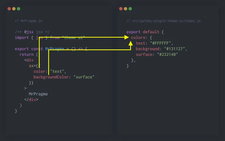
The relationship between the CSS properties and where in the theme objet Theme UI will shorthand the lookup is detailed in the Theme Scales
The first part of the Theme Scales table explains the following:
| Theme Key | CSS Properties |
|---|---|
| colors | color, background-color, border-color |
This means that whenever you’re applying a CSS property of color, background-color or border-color Theme UI will
automatically look to the colors object and return the resulting value.
This is just an introduction to Theme UI and in later posts i’ll be explaining the relationship between CSS properties and the theme object in more depth, so stay tuned and give me a follow on Twitter 🕺